고정 헤더 영역

상세 컨텐츠
본문
웹 개발 챌린지 : 나만의 웹 서비스 만들기
https://bootcamp.likelion.net/courses/technology/next_myweb
더보기
목차
챕터 5. 웹 레이아웃 구성하기
5-1. position
5-2. flex
5-3. 웹사이트를 만들기 위한 준비 (bootstrap, 이미지, 폰트 적용)
5-4. [과제] 간단한 디자인 사이트 만들기
챕터 5. 웹 레이아웃 구성하기
5-1. position
position
부모 태그에 position:relative를 주고 자식 태그에 position:absolute를 주면 자식 태그에 top | left | right | bottom 속성을 줄 수 있음
회색 박스를 검은색 박스 오른쪽 위에 위치시키기

방법 1. margin-left를 사용하여 위치시키기

문제점: 부모(회색) 박스의 크기 변경 시 위치를 다시 잡아야 함
방법 2. margin-left에 비율 적용
*자식 태그의 margin을 비율로 주면 부모 태그의 비율만큼 적용(시작점이 바뀌는 것)
*CSS 함수에 있는 calc 함수 이용

부모(회색) 박스의 크기가 변경되어도 오른쪽 위에 위치 가능
문제점: 자식(검은색) 박스의 크기 변경 시 calc 부분도 수정해야 함
방법 3. position 이용하기
위의 문제를 해결해 주는 것이 position

position의 특징
1. absolute는 반드시 부모 태그들 중 첫번째 relative만 참조한다. (absolute 기준)
<body style="position:relative"> ①
<div style="width:50px;height:50px;background:black;
position:absolute;top:0px;right:0px">
</div>
</div>
</body>
<div style="width:300px;height:150px;background:gray;position:relative"> ②
<div style="width:50px;height:50px;background:black;
position:absolute;top:0px;right:0px">
</div>
</div>
</body>
- 여기서는 ①이 아닌 ②의 relative가 기준
<body style="position:relative"> ①
<div style="position:relative"> ②
</div>
<div style="width:300px;height:150px;background:gray">
<div style="width:50px;height:50px;background:black;
position:absolute;top:0px;right:0px">
</div>
</div>
</body>
<div style="position:relative"> ②
</div>
<div style="width:300px;height:150px;background:gray">
<div style="width:50px;height:50px;background:black;
position:absolute;top:0px;right:0px">
</div>
</div>
</body>
- ②는 부모태그가 아니므로 ①의 relative가 기준
2. absolute는 형제 태그들의 영역을 무시한다.
오로지 relative만 참고, 형제 태그는 덮음
<body>
<div style="width:200px;height:250px;background:gray;margin:10px">
<div style="width:100px;height:100px;background:red"></div>
<div style="width:70px;height:70px;background:blue">position(X)</div>
</div>
<div style="width:200px;height:250px;background:gray;margin:10px;position:relative">
<div style="width:100px;height:100px;background:red"></div>
<div style="width:70px;height:70px;background:blue;position:absolute;top:0px;left:0px;">position(O)</div>
</div>
</body>

(참고) 부모 태그에 margin을 주면 자식 태그에도 영향을 미침
5-2. flex
표지를 만드는 개념과 웹사이트를 만드는 개념은 매우 흡사
기존 CSS 레이아웃 코딩의 한계: float, margin, position 등으로 레이아웃을 잡으면 코드가 복잡해짐
가운데 정렬, 세로 정렬 등 레이아웃 배치를 마치 문서 편집 툴처럼 쉽게 할 수 있는 기능 필요
그것이 display:flex;
(참고) 텍스트 가운데 정렬 text-align:center;
속성
1. flex-direction: row(기본값) | column | row-reverse | column-reverse
2. 주축(mainAxis = justify-content)
justify-content: flex-start(기본값) | flex-end | center | space-between
3. 크로스축(crossAxis = align-items)
align-items: flex-start(기본값) | flex-end | center | space-between
flex-direction: row
- 주축: x축 / 크로스축: y축

<body>
<!--flex-direction:row; justify-content:flex-start;-->
<div style="width:300px;height:150px;background:blue;color:white;margin:10px;
display:flex;flex-direction:row;justify-content:flex-start">
<span>Login</span>
<span>Login</span>
<span>Login</span>
</div>
<!--flex-direction:row; justify-content:center;-->
<div style="width:300px;height:150px;background:blue;color:white;margin:10px;
display:flex;flex-direction:row;justify-content:center">
<span>Login</span>
<span>Login</span>
<span>Login</span>
</div>
<!--flex-direction:row; justify-content:flex-end;-->
<div style="width:300px;height:150px;background:blue;color:white;margin:10px;
display:flex;flex-direction:row;justify-content:flex-end">
<span>Login</span>
<span>Login</span>
<span>Login</span>
</div>
<!--flex-direction:row; justify-content:space-between;-->
<div style="width:300px;height:150px;background:blue;color:white;margin:10px;
display:flex;flex-direction:row;justify-content:space-between">
<span>Login</span>
<span>Login</span>
<span>Login</span>
</div>
</body>
flex-direction: row
- 주축: y축 / 크로스축: x축

<body>
<!--flex-direction:column; justify-content:flex-start;-->
<div style="width:300px;height:150px;background:blue;color:white;margin:10px;
display:flex;flex-direction:column;justify-content:flex-start">
<span>Login</span>
<span>Login</span>
<span>Login</span>
</div>
<!--flex-direction:column; justify-content:center;-->
<div style="width:300px;height:150px;background:blue;color:white;margin:10px;
display:flex;flex-direction:column;justify-content:center">
<span>Login</span>
<span>Login</span>
<span>Login</span>
</div>
<!--flex-direction:column; justify-content:flex-end;-->
<div style="width:300px;height:150px;background:blue;color:white;margin:10px;
display:flex;flex-direction:column;justify-content:flex-end">
<span>Login</span>
<span>Login</span>
<span>Login</span>
</div>
<!--flex-direction:column; justify-content:space-between;-->
<div style="width:300px;height:150px;background:blue;color:white;margin:10px;
display:flex;flex-direction:column;justify-content:space-between">
<span>Login</span>
<span>Login</span>
<span>Login</span>
</div>
</body>
5-3. 웹사이트를 만들기 위한 준비 (bootstrap, 이미지, 폰트 적용)
스프링 프로젝트 새로 생성: likelion_movie_web


I. CSS 라이브러리 - Bootstrap
1. 직접 다운로드 받기 (https://getbootstrap.com/)

resources/static에 css 폴더 생성
bootstrap.css와 bootstrap.min.css를 resources/static/css에 넣기
*bootstrap.min.css는 가독성을 위한 줄바꿈이 없기 때문에 용량이 더 작음


css 파일 연결
html 파일의 <head> 태그에 다음 내용으로 css 파일 연결
**여기서 연결이 안 되는 오류 발생 - 해결과정: https://siwon-swu18.tistory.com/89
<link rel="stylesheet" href="/css/bootstrap.css"/>
2. CDN 다운로드 (Content Delivery Network) - 주로 사용!
<link href=""> 복사해서 html 파일에 붙여넣기
주소를 통해 받아오기 때문에 서버에 문제가 생기면 적용이 안 됨 (문제가 생기는 경우는 많지 않음)
CDN만 제공하는 경우, 텍스트 복사 후 CSS 파일을 만들어 사용해도 됨

<link href="https://cdn.jsdelivr.net/npm/bootstrap@5.3.3/dist/css/bootstrap.min.css"
rel="stylesheet" integrity="sha384-QWTKZyjpPEjISv5WaRU9OFeRpok6YctnYmDr5pNlyT2bRjXh0JMhjY6hW+ALEwIH"
crossorigin="anonymous">
rel="stylesheet" integrity="sha384-QWTKZyjpPEjISv5WaRU9OFeRpok6YctnYmDr5pNlyT2bRjXh0JMhjY6hW+ALEwIH"
crossorigin="anonymous">
Buttons 적용해보기
Buttons > HTML 파일 복사


II. 이미지
resources/static에 image 폴더 생성 후 파일 넣기
<img src="/image/파일명"> 태그 사용
<!--이미지-->
<img src="/image/bg.jpg"/>
<img src="/image/logo.png"/>
<img src="/image/bg.jpg"/>
<img src="/image/logo.png"/>

III. 글자체(font) 적용
ttf 혹은 otf 파일 형식으로 받아서 적용 (CSS에서 적용)
resources/static에 font 폴더 생성
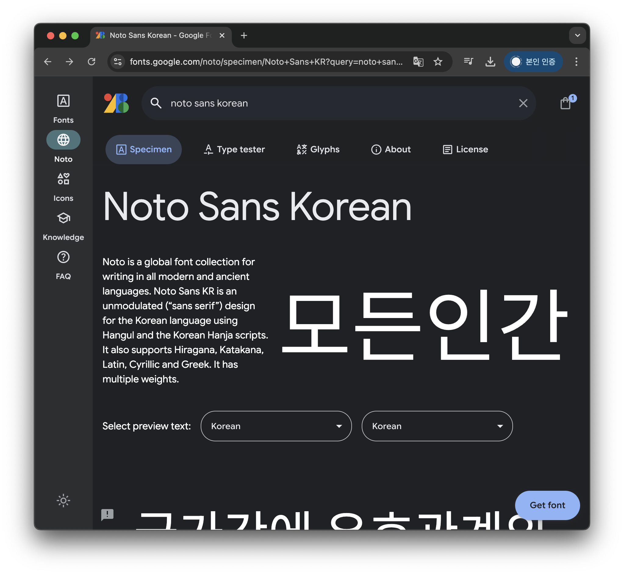
Google Fronts에서 Noto Sans Korean 다운로드 후 font 폴더에 저장 (https://fonts.google.com/)

별도의 css 파일 생성 (index.css)
@font-face {
font-family: "basic"; /*임의로 설정*/
font-style: normal;
src: url(/font/NotoSansKR-Black.ttf) format('truetype');
}
@font-face {
font-family: "bold";
font-style: normal;
src: url(/font/NotoSansKR-Medium.ttf) format('truetype');
}
#id_font_basic{
font-family:basic;
}
#id_font_bold{
font-family:bold;
}
font-family: "basic"; /*임의로 설정*/
font-style: normal;
src: url(/font/NotoSansKR-Black.ttf) format('truetype');
}
@font-face {
font-family: "bold";
font-style: normal;
src: url(/font/NotoSansKR-Medium.ttf) format('truetype');
}
#id_font_basic{
font-family:basic;
}
#id_font_bold{
font-family:bold;
}
html 파일에 index.css 연결 후 사용
<head>
<link rel="stylesheet" href="/css/index.css"/>
</head>
<body>
<!--폰트-->
<div id="id_font_basic">font_basic 베이직 폰트</div>
<div id="id_font_bold">font_bold 볼드 폰트</div>
</body>
<link rel="stylesheet" href="/css/index.css"/>
</head>
<body>
<!--폰트-->
<div id="id_font_basic">font_basic 베이직 폰트</div>
<div id="id_font_bold">font_bold 볼드 폰트</div>
</body>

IV. 아이콘
아이콘 오픈소스 - fontawesome (https://fontawesome.com/)
가입 후 받은 태그를 <head>에 붙여넣기
원하는 아이콘의 HTML 복사해서 사용
<img src="/image/logo.png"/>


cbn으로 적용하기 (https://cdnjs.com/libraries/font-awesome)
첫번째 코드를 복사해서 <head>에 붙여도 fontawesome 사용 가능
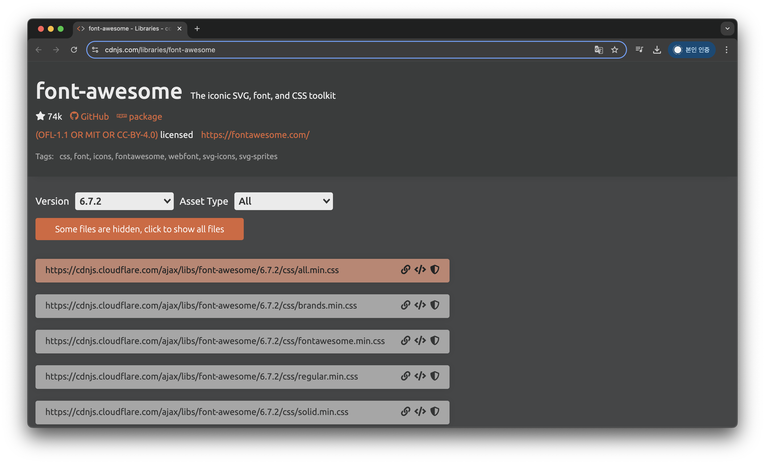
<link rel="stylesheet" href="https://cdnjs.cloudflare.com/ajax/libs/font-awesome/6.7.2/css/all.min.css" integrity="sha512-Evv84Mr4kqVGRNSgIGL/F/aIDqQb7xQ2vcrdIwxfjThSH8CSR7PBEakCr51Ck+w+/U6swU2Im1vVX0SVk9ABhg==" crossorigin="anonymous" referrerpolicy="no-referrer" />
style 적용하기
text처럼 style 적용 가능 (색상, 크기 등)
<i class="fa-solid fa-user" style="color:red;font-size:30px"></i>

5-4. [과제] 간단한 디자인 사이트 만들기
아래 이미지 참고해서 사이트 만들기

내가 만든 사이트

전체 코드
https://siwon-swu18.tistory.com/96
(참고) body 태그에는 기본 margin이 설정되어 있는 경우가 많으니 아래 코드처럼 기본값 설정하기
body{
	font-family:basic;
    font-size:14px;
    margin:0;
}
FIN.
728x90
'[SW] > 웹 개발 (2025)' 카테고리의 다른 글
| [웹 개발 챌린지] 8. REST API & 9. 실습 (1) | 2025.01.31 |
|---|---|
| [웹 개발 챌린지] 6. Javascript & 7. jQuery (0) | 2025.01.30 |
| [웹 개발 챌린지] 3. HTML & 4. CSS (2) | 2025.01.27 |
| [웹 개발 챌린지] 1. 웹 개념 & 2. Spring Boot, JSP, Intelij (2) | 2025.01.24 |
| [일단 만드는 HTML/CSS] HTML/CSS로 만드는 나만의 이력서 (0) | 2025.01.17 |


댓글 영역